How we enhanced the Checkout journey, lowering abandonment by 29%

THE PROBLEM


17% of online customers would abandon completing their order purchase because of the lengthy checkout process.

A summary of key insights from moderated user testing, focusing on user needs, pain points, evolving business goals, and technical challenges:

Users nearing the end of their purchase journey were unexpectedly redirected to modify their fulfillment choices.

Management was looking into simplifying fulfillment-related terminology to make the decision-making process easier for users.

The outdated codebase restricted major changes and needed a complete backend overhaul to optimize performance.

Users found the mobile experience overwhelming due to excessive scrolling.

Forms were seen as burdensome, with too many repetitive fields to complete.


SCOPE AND OBJECTIVES


SOLUTION & IMPACT


We redesigned the checkout journey as follows:

  • Simplified checkout by eliminating redundant form fields and unnecessary data.
  • Reduced fulfillment categories from 5 to 2, decreasing complexity.
  • Minimized checkout abandonment by adding delivery scheduling and store selection in cart.
  • Enhanced the visibility of the order total and organized the summary intuitively for mobile, reducing excessive scrolling


Usability testing with 24 users showed a 46% decrease in checkout time, from 4.1 to 2.2 minutes. Users gave a rating of 4.8/5 for the new checkout experience


KEY DESIGN MILESTONES


Users can now select a different pick-up store during checkout, without redirection.

What problem we solved & why

Because there was no option to change the pick-up store on the page, users were redirected back to the cart, causing many customers to abandon the checkout process.

How we solved it

We adapted the existing slide-in panel component to display nearby stores with the product in stock, along with their addresses. Users can choose a different store, and the update will automatically apply in checkout.

What users thought

  • Users found it intuitive to view alternative store options with the product in stock on both desktop and mobile.
  • The cart summary reflected selection changes, with items clearly organized by store and pickup date, making it easy for most users to understand.
  • Some users appreciated the the date picker being easily accessible compared to a standard calendar widget


Simplified fulfillment-related jargon for customers, broadly categorizing options as pickup and delivery.

What problem we solved & why

Users found complex fulfillment terminology confusing throughout their shopping journey. Through UX research and design workshops, I highlighted industry practices to advocate for simplifying user comprehension.

How we solved it

We streamlined fulfillment into two broad, easy-to-understand options at the front end: pickup and delivery. The UX copywriting team created jargon-free language that resonated with stakeholders, earning their support and commitment to roll out the changes across teams.

What users thought

  • Most users easily understood the grouping by estimated pickup and delivery dates and appreciated the cart summary’s organization by date recency.
  • We also also received positive feedback for minimal aesthetics and clear visual hierarchy


Enhanced mobile experience for faster checkout

What problem we solved & why

Mobile users experienced excessive scrolling to view product details, review forms, and access the order summary, leading to friction and checkout abandonment.

How we solved it

Revising the information architecture and highlighting key decision-making details were crucial. We streamlined the form by reducing input fields, combining fulfillment options into Pickup and Delivery, showing relevant products, and adding a collapsible cart with a sticky, interactive order summary.

What users thought

  • Users easily understood how to expand the cart by delivery date and appreciated the interactive sticky order total for quick access to the summary.
  • Some users needed time to understand the Delivery section, which only showed products requiring scheduled delivery.
  • The simplified checkout process was well-received, particularly by Home Depot customers who preferred it over the previous experience.


RESULTS


We conducted a usability test with 24 customers who had previously shopped on the Home Depot Canada website and were familiar with online shopping on other platforms. Key aspects tested included:

  • Reduction in users leaving the checkout to return to the cart.
  • Clarity of users on the difference between signing in and guest checkout.
  • User feedback on the simplified fulfillment process and form completion.
  • User patience and willingness to complete all tasks during checkout.

Average checkout time was reduced from 4.1 minutes to 2.2 minutes, a 46% improvement. Users gave a rating of 4.8/5 for the new checkout experience.After implementing the new checkout flow, checkout abandonment rates dropped by 29%, and form completion increased by 55%.From a business impact standpoint, we anticipated a15% increase in sales during the first quarter.


The new checkout feels faster and more intuitive compared to the previous version.
- users during moderated interviews


RESEARCH & SCOPE


17% of cart abandonment was a concerning statistic that prompted us to conduct multiple rounds of research, including moderated interviews, competitor analysis and review of best practices in literature.

Through moderated testing with frequent online shoppers on the current checkout experience and by analyzing competitor websites, we uncovered key insights

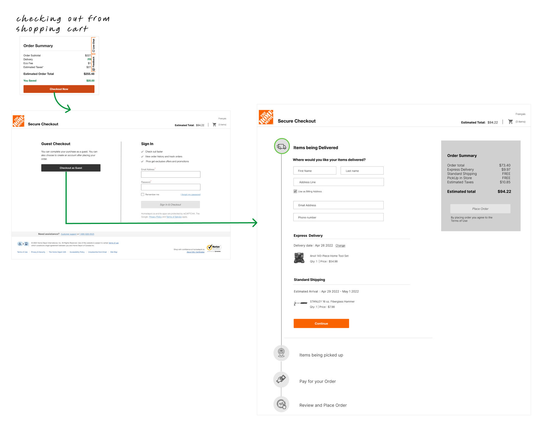
Existing Checkout design

We interviewed 16 online shoppers, through Moderated Interviews, about their decision-making and checkout experiences, uncovering key insights:

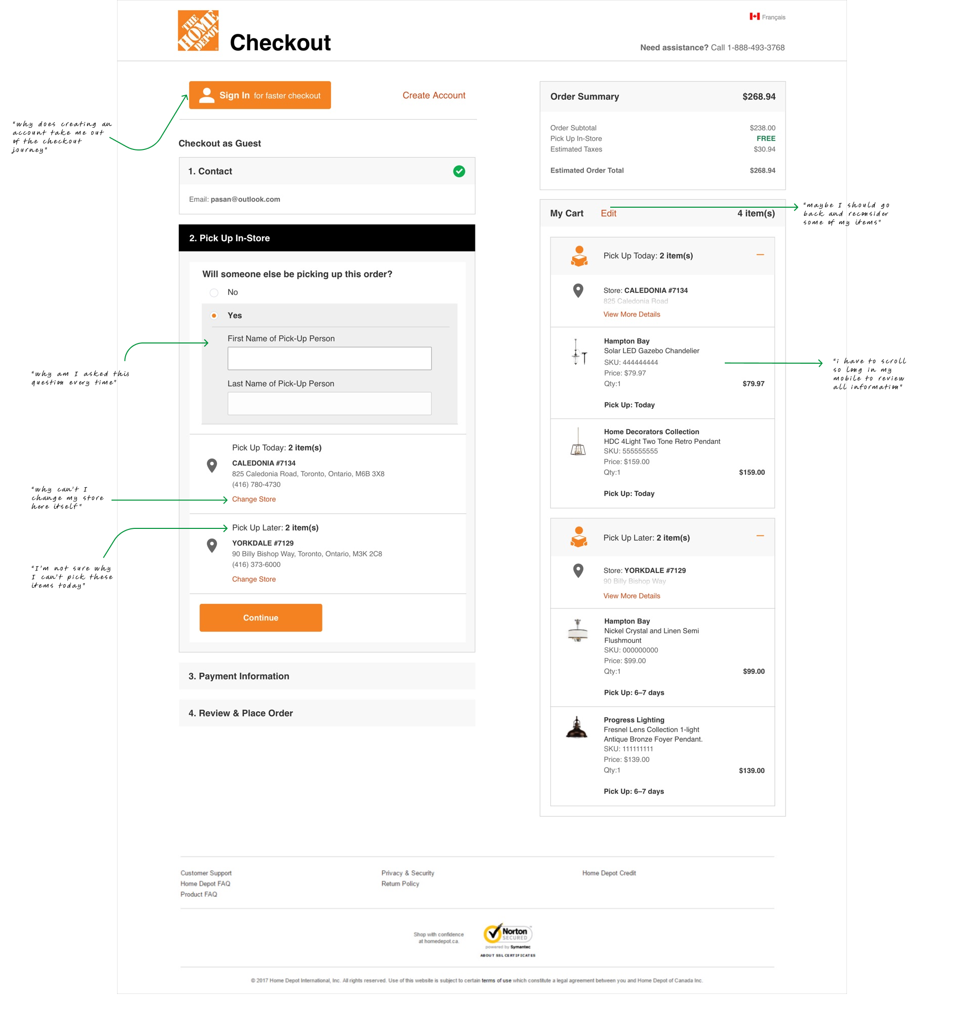
  • 74% of orders were placed by guest users, avoiding account creation due to perceived lack of benefits.
  • 45.7% of customers found the mobile checkout slow and frustrating, specially for scheduling, citing excessive scrolling compared to competitors like Wayfair, Lowe’s, Amazon, and IKEA.

We analyzed 18 retail/e-commerce brands, focusing on page layout, information architecture, design patterns, fulfillment options, guest vs. signed-in checkout, account creation, and cart display. Key learnings from competitor analysis include:

  • Retailers used three checkout layouts: full one-page, accordion-style, or multi-step with focused form details
  • Over half streamlined forms to reduce redundancy and simplify interaction.
  • All retailers displayed finalized purchase items and avoided distracting calls to action.
  • Less than half allowed store selection and pickup/delivery scheduling, which improved UX.
  • Most retailers users Guest Vs Signed in checkout as an intermediate step between cart and checkout.
  • Product info varied from minimal to detailed displays.
  • Few had a clear visual hierarchy with icons, imagery, and spacing.
  • Mobile experiences were often lengthy, but multistep layouts offered a more streamlined process.

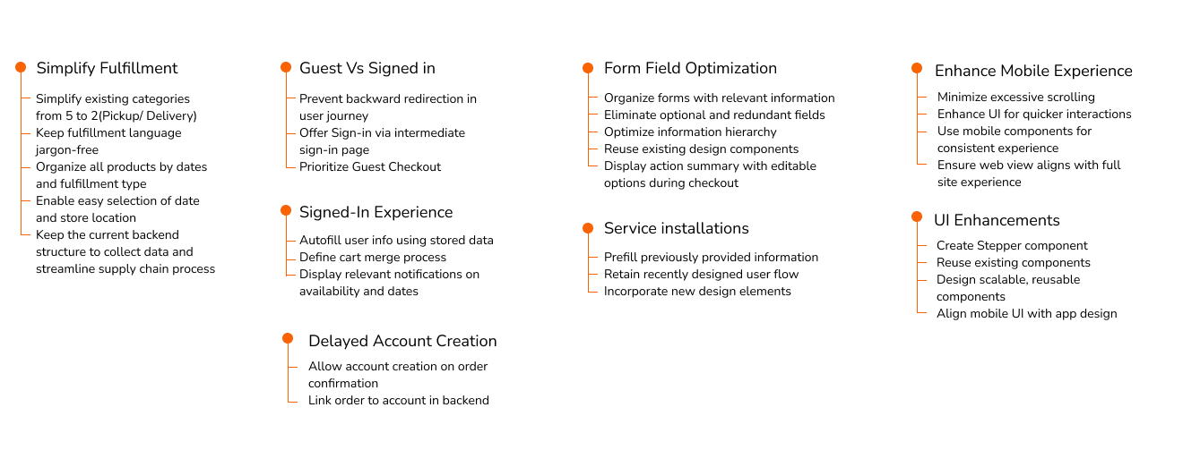
After our primary research phase, we mapped out the scope of the project into the following:
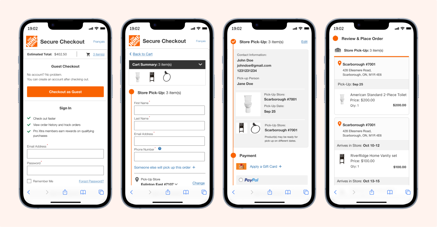
1. Intermediate Sign-in - transition from shopping cart to checkout
2. Guest Checkout Experience - with single fulfillment
3. Guest Checkout Experience - with multiple fulfillment scenarios and services installation
4. Signed-In user experience
5. Merge Cart Situation - what happens when a user signs in at checkout and there are older items added to checkout
6. Local Pro Service installation selection
7. Delayed account creation


SPRINT 0 - CONCEPT SKETCHING


To improve the checkout experience, I recommended the following:

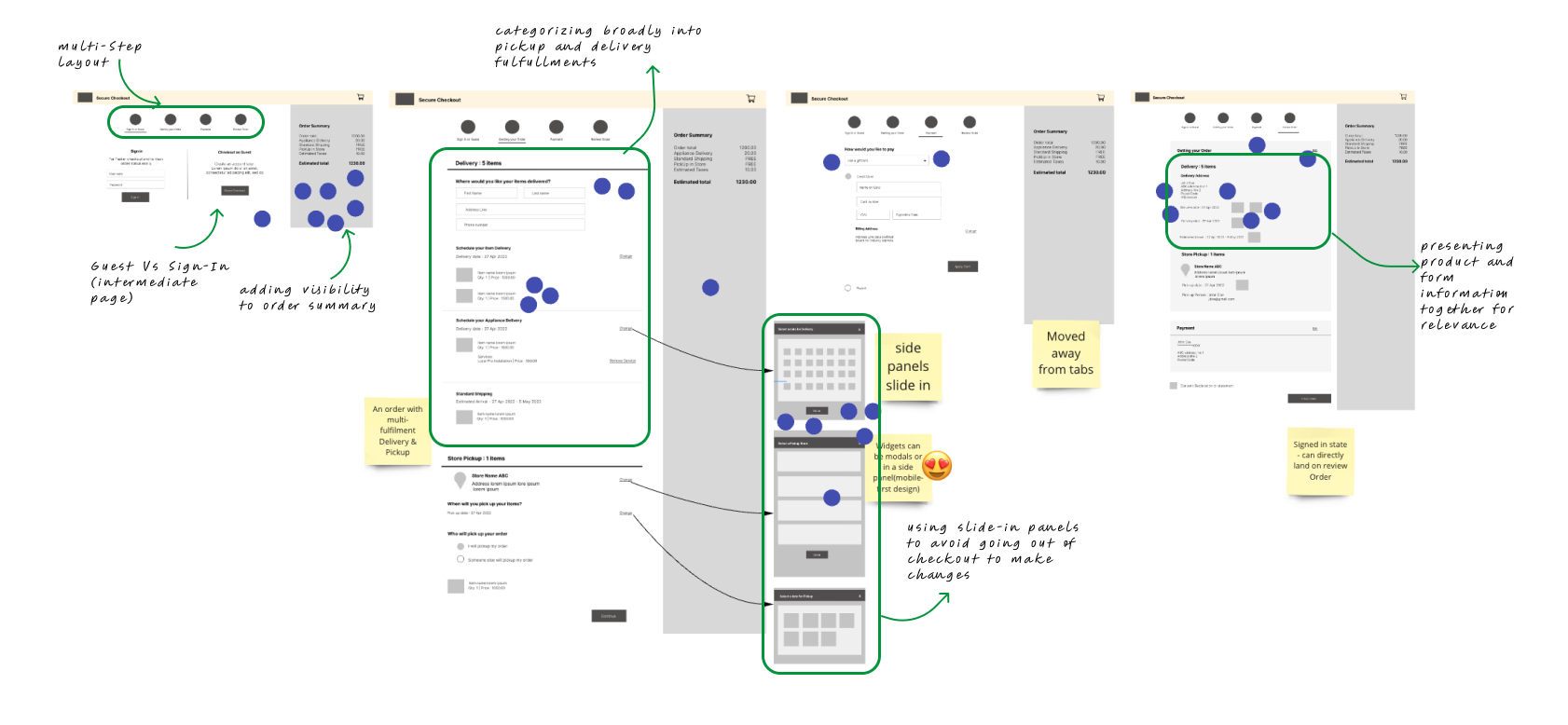
  • Multi-step Checkout journey: Based on competitor analysis and Baymard, I broke the process into key steps: Sign-in, Fulfillment options (Pickup/Delivery), Payment, and Review, improving focus and auto-filling details.
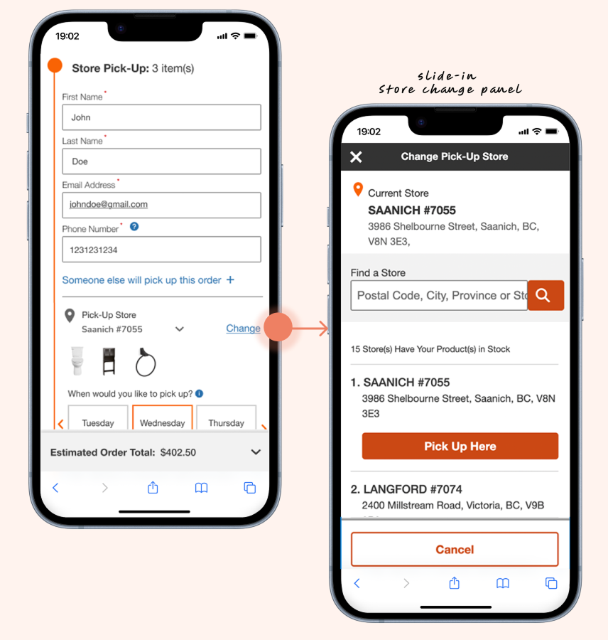
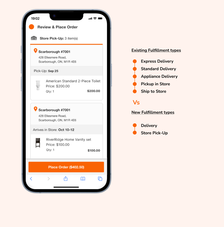
  • Page Layout: I kept forms and product details in the left column and the order summary in the right. I consolidated 7 fulfillment categories into 2 (Delivery/Pickup) and included estimated delivery dates to simplify choices.
  • Reusable components/Widgets: I reused the side panel for the date calendar and store selector, reducing UI clutter and improving usability across devices.
  • Simplifying Payment: I replaced tabs with radio buttons to show all payment options upfront, making choices more visible.
  • Signed In users: Pre-populated data for signed-in users, enabling them to review and make quick edits before completing the purchase.
  • Keeping order total always visible: I kept the order summary visible at all times, with the total at the top on mobile, based on user feedback that it’s frequently referenced during checkout.

Voted features:
After reviewing ideas and discussing benefits and risks, we voted on the following directions for our checkout solution:

  • Include an intermediate sign-in page.
  • Use an accordion layout to align with the existing experience, as multi-step checkout did not show significant benefits due to the minimal form fields for common fulfillment options.
  • Allow customers to change the pickup store to reduce abandonment.
  • Allow customers to change the pickup store to reduce abandonment
  • Reduce redundant form fields and collaborate with the product team to identify mandatory data.


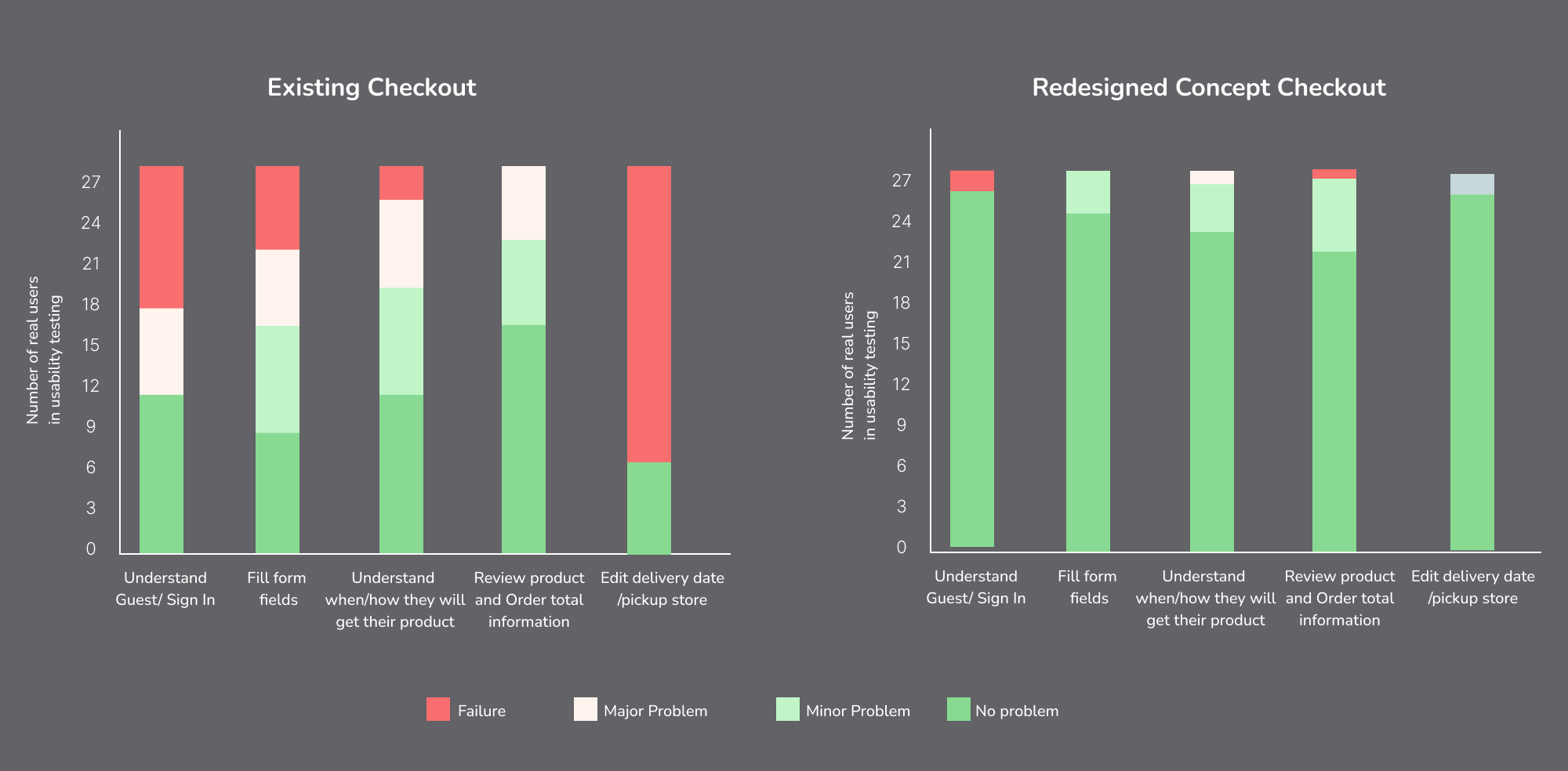
INSIGHTS FROM CONCEPT TESTING


We assessed the cart-to-checkout journey, including the intermediate sign-in page, capturing user reactions, evaluating checkout layout clarity and usability, and gathering feedback on missing elements and unmet expectations.

Key insights from our concept testing that will guide further development:

  • Clarity of the intermediate sign-in page: Users easily understood the page's purpose, with guest checkout prioritized as the main option.
  • Expectations for a detailed cart view: Users wanted a clear cart summary, so we reintroduced a minimal version in the checkout flow.
  • Visual design alignment: We identified the need to refine the checkout page's design to align with the website's overall style, to be tested in future user research.